User interface
Demo mock-up
About widgets
Speedometers
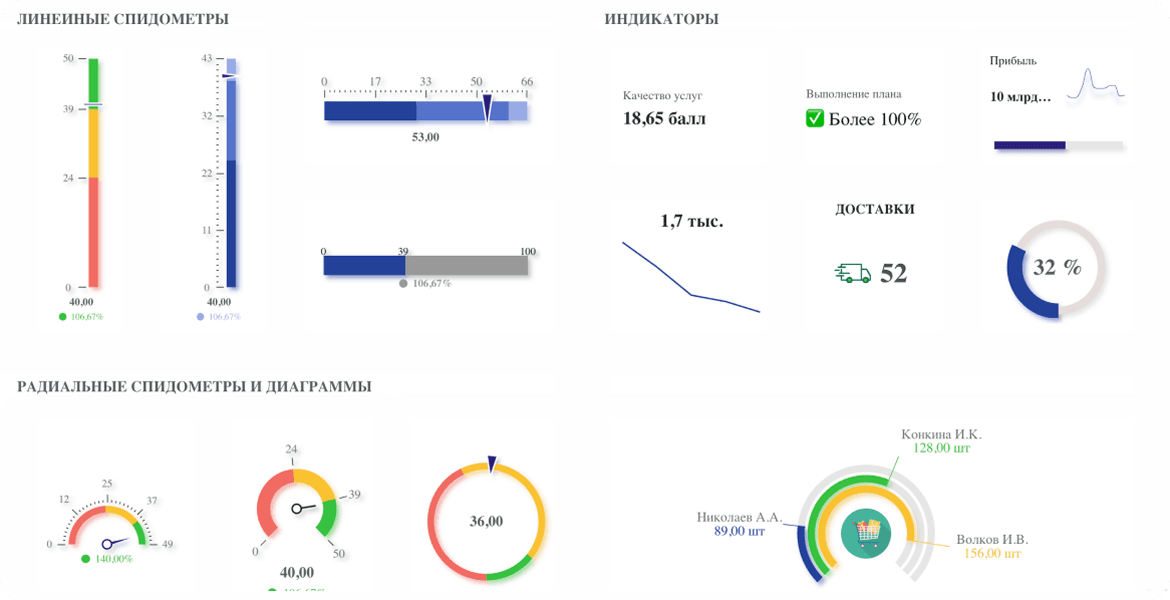
Speedometers visually display KPI performance relative to target values. KPI MONITOR offers 4 types of speedometers: linear, radial, diagrams, and indicators.
Composite charts
 Pie charts
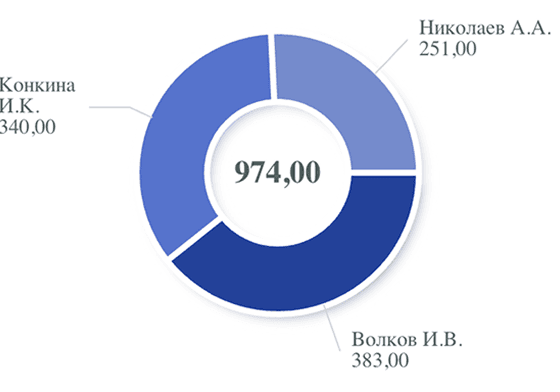
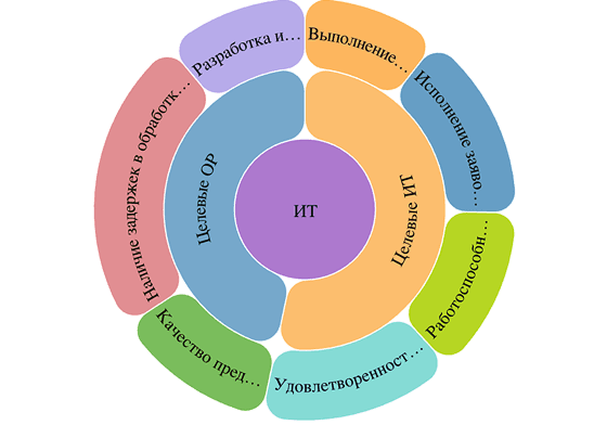
Sunburst charts
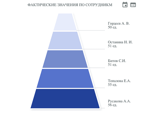
Funnel charts
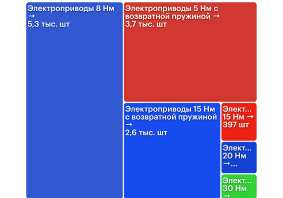
Treemaps
Tables
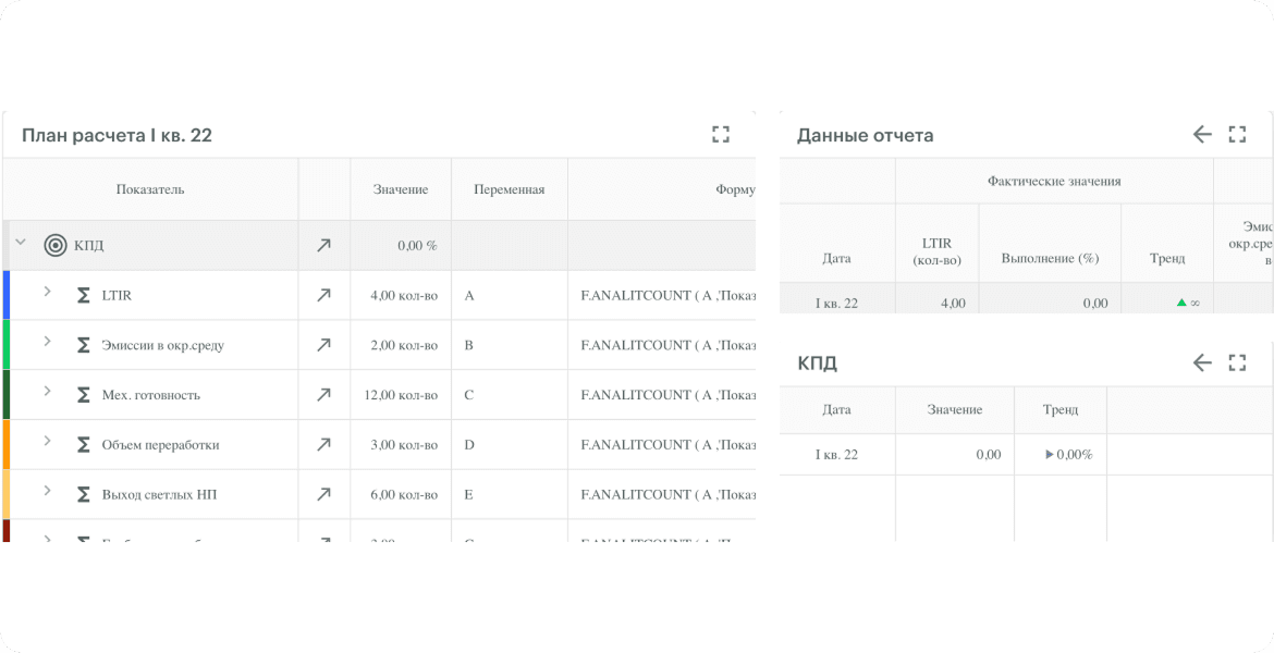
Calculation plans
Calculation plans are tables that store information about the calculation of specific parameters. A calculation plan may include formulas, details about measurement steps, filters and patterns for their application to a particular calculation, and other information necessary for implementing the calculation plan.
Calculation plans are tables that store information about the calculation of specific parameters. A calculation plan may include formulas, details about measurement steps, filters and patterns for their application to a particular calculation, and other information necessary for implementing the calculation plan.
Heat maps
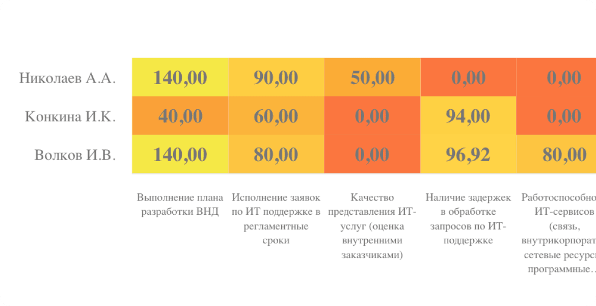
The key advantage of heat maps lies in their visual clarity, which simplifies the analysis of large datasets. Heat maps are used to identify patterns, relationships, and to visualize data efficiently. Such maps are most commonly applied to analyze traffic, sales, product or service demand, and other metrics.
The key advantage of heat maps lies in their visual clarity, which simplifies the analysis of large datasets. Heat maps are used to identify patterns, relationships, and to visualize data efficiently. Such maps are most commonly applied to analyze traffic, sales, product or service demand, and other metrics.
KPI map
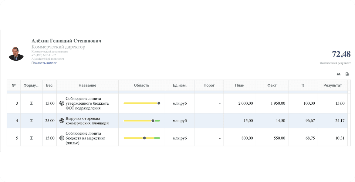
A KPI map displays an employee’s performance, enabling tracking of work volume, speed, and quality, as well as the status of current tasks and their deadlines.
A KPI map displays an employee’s performance, enabling tracking of work volume, speed, and quality, as well as the status of current tasks and their deadlines.
Reports with breakdown by multiple analytics
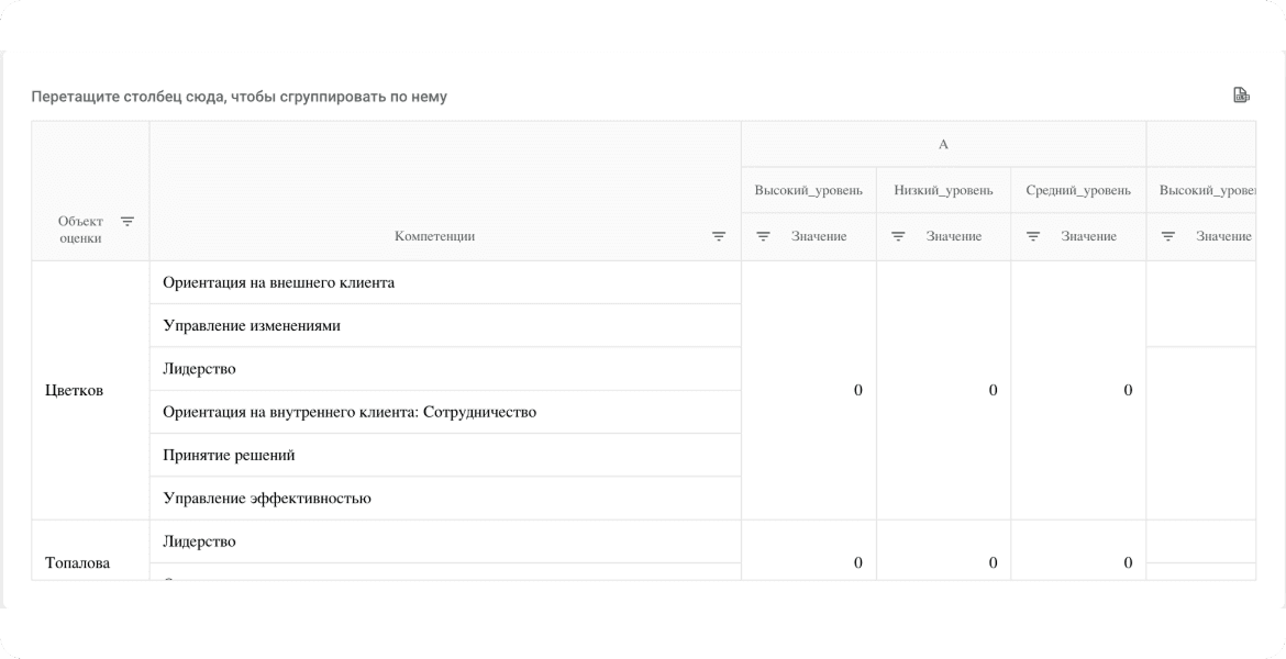
This type of report is designed to analyze processes across several parameters. The example provided showcases a report evaluating employees from different professional categories based on multiple competencies for each employee.
This type of report is designed to analyze processes across several parameters. The example provided showcases a report evaluating employees from different professional categories based on multiple competencies for each employee.
Tabular Reports
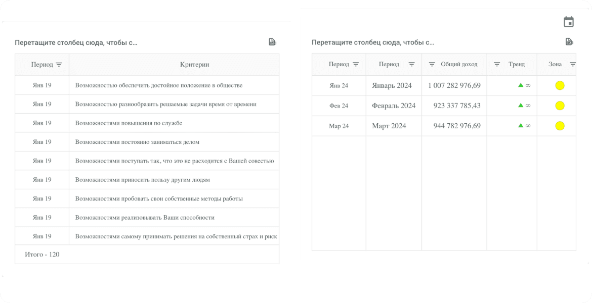
Tabular reports are advantageous because the information they contain is not only easy to perceive but also readily filterable and sortable, simplifying data handling.
Tabular reports are advantageous because the information they contain is not only easy to perceive but also readily filterable and sortable, simplifying data handling.
Pivot
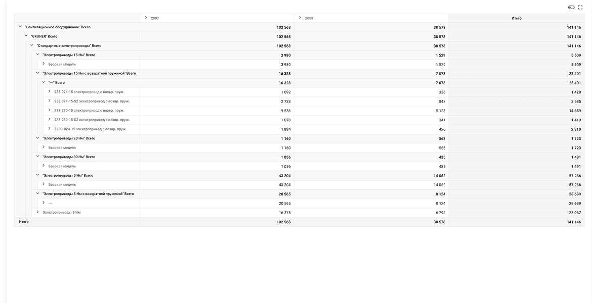
Pivot Table. Designed for analyzing and summarizing data from other tables.
Pivot Table. Designed for analyzing and summarizing data from other tables.
Hierarchical tables
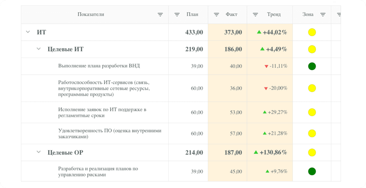
Hierarchical tables are a convenient tool for presenting large amounts of composite data. In the example, we know the planned value of target IT indicators but can also see which specific IT components contribute to this value.
Hierarchical tables are a convenient tool for presenting large amounts of composite data. In the example, we know the planned value of target IT indicators but can also see which specific IT components contribute to this value.
Calculation plans
Calculation plans are tables that store information about the calculation of specific parameters. A calculation plan may include formulas, details about measurement steps, filters and patterns for their application to a particular calculation, and other information necessary for implementing the calculation plan.
Calculation plans are tables that store information about the calculation of specific parameters. A calculation plan may include formulas, details about measurement steps, filters and patterns for their application to a particular calculation, and other information necessary for implementing the calculation plan.
Heat maps
The key advantage of heat maps lies in their visual clarity, which simplifies the analysis of large datasets. Heat maps are used to identify patterns, relationships, and to visualize data efficiently. Such maps are most commonly applied to analyze traffic, sales, product or service demand, and other metrics.
The key advantage of heat maps lies in their visual clarity, which simplifies the analysis of large datasets. Heat maps are used to identify patterns, relationships, and to visualize data efficiently. Such maps are most commonly applied to analyze traffic, sales, product or service demand, and other metrics.
Charts
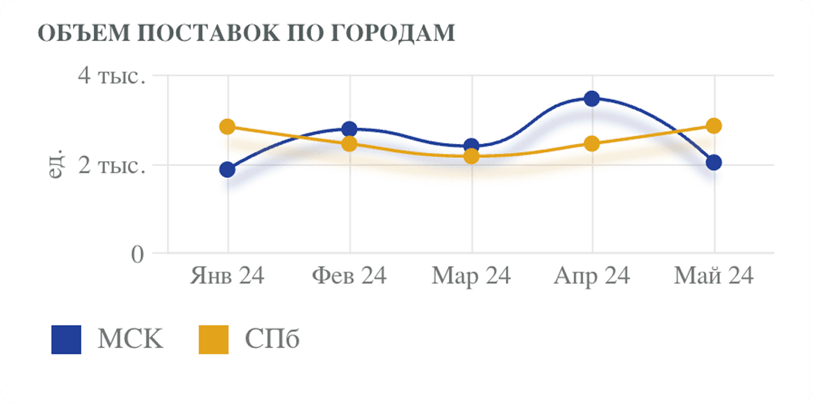
Visualization using the Chart component enables comparison of values, tracking their changes over time, and correlation with other variables. KPI MONITOR also allows segmenting data across multiple dimensions using various reference guides.
SVG-objects
Containers
Scroll-container
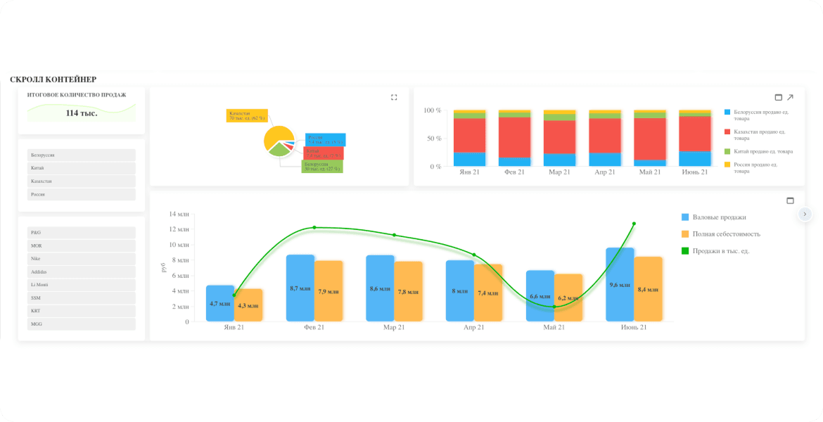
For dashboards that need to display a large number of widgets, a scroll-container is a convenient solution. It divides the dashboard into multiple screens, allowing users to navigate between them with a single click. The example provided showcases a scroll-container in a sales dashboard. The first screen displays sales statistics with charts and graphs, providing an overview of sales trends and the overall situation. The second screen primarily features tabular data, which is useful for analyzing more specific information and process details.
For dashboards that need to display a large number of widgets, a scroll-container is a convenient solution. It divides the dashboard into multiple screens, allowing users to navigate between them with a single click. The example provided showcases a scroll-container in a sales dashboard. The first screen displays sales statistics with charts and graphs, providing an overview of sales trends and the overall situation. The second screen primarily features tabular data, which is useful for analyzing more specific information and process details.
About containers
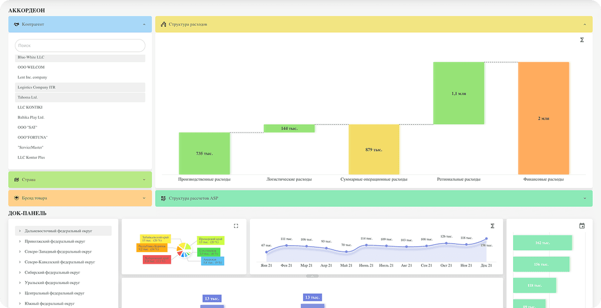
For effective data visualization and analytics, it is essential to be able to group data and define the display order on the dashboard. To enable this, KPI MONITOR implements data containers.
For effective data visualization and analytics, it is essential to be able to group data and define the display order on the dashboard. To enable this, KPI MONITOR implements data containers.
Accordion
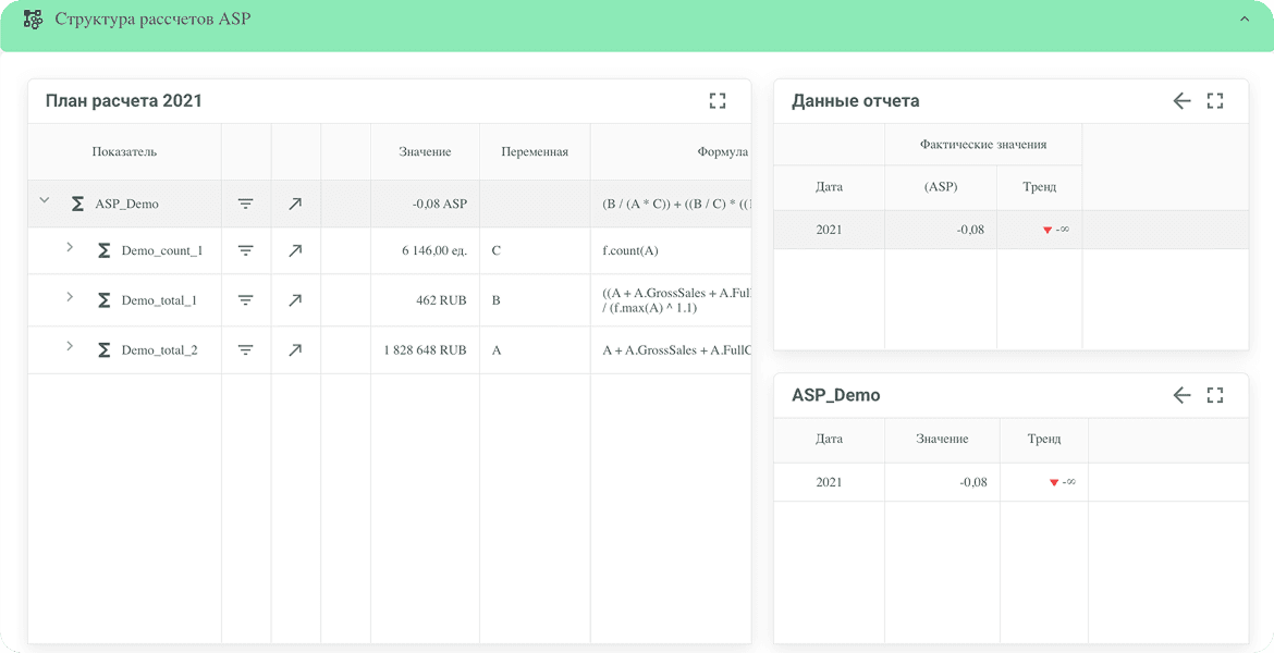
An accordion is a collapsible panel that can contain text lists, charts, tables, or other graphical representations.
Its primary purpose is to save space on the dashboard while maintaining functionality and informativeness.
An accordion is a collapsible panel that can contain text lists, charts, tables, or other graphical representations.
Its primary purpose is to save space on the dashboard while maintaining functionality and informativeness.
Dock panel
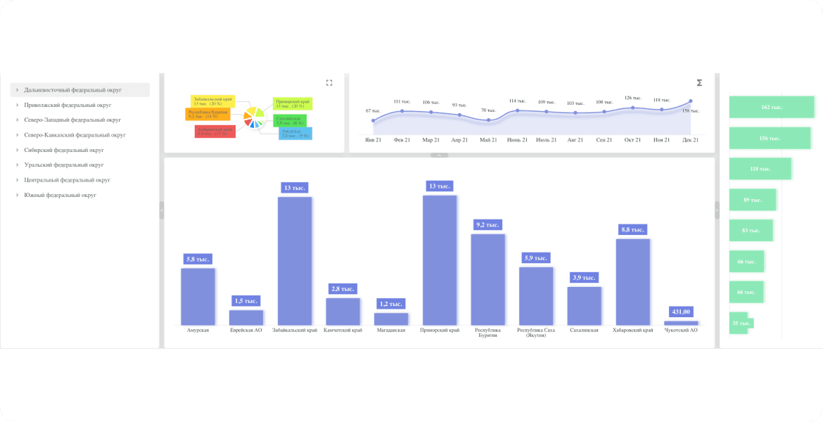
To arrange multiple widgets belonging to the same category on a single dashboard, dock panels are a convenient solution.
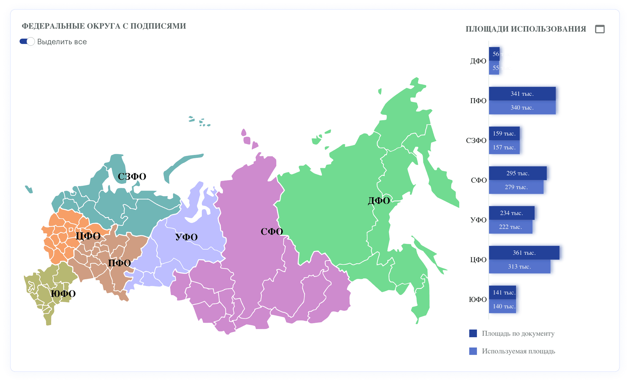
The example provided showcases a dashboard with statistics for Russian regions. Displaying information for all districts on a single dashboard would be impractical, as it would become cognitively overloaded. Dock panels make the dashboard more visually clear while preserving the ability to switch between categories with a single click.
To arrange multiple widgets belonging to the same category on a single dashboard, dock panels are a convenient solution.
The example provided showcases a dashboard with statistics for Russian regions. Displaying information for all districts on a single dashboard would be impractical, as it would become cognitively overloaded. Dock panels make the dashboard more visually clear while preserving the ability to switch between categories with a single click.
Scroll-container
For dashboards that need to display a large number of widgets, a scroll-container is a convenient solution. It divides the dashboard into multiple screens, allowing users to navigate between them with a single click. The example provided showcases a scroll-container in a sales dashboard. The first screen displays sales statistics with charts and graphs, providing an overview of sales trends and the overall situation. The second screen primarily features tabular data, which is useful for analyzing more specific information and process details.
For dashboards that need to display a large number of widgets, a scroll-container is a convenient solution. It divides the dashboard into multiple screens, allowing users to navigate between them with a single click. The example provided showcases a scroll-container in a sales dashboard. The first screen displays sales statistics with charts and graphs, providing an overview of sales trends and the overall situation. The second screen primarily features tabular data, which is useful for analyzing more specific information and process details.
About containers
For effective data visualization and analytics, it is essential to be able to group data and define the display order on the dashboard. To enable this, KPI MONITOR implements data containers.
For effective data visualization and analytics, it is essential to be able to group data and define the display order on the dashboard. To enable this, KPI MONITOR implements data containers.
Demo mock-up
Interface capabilities
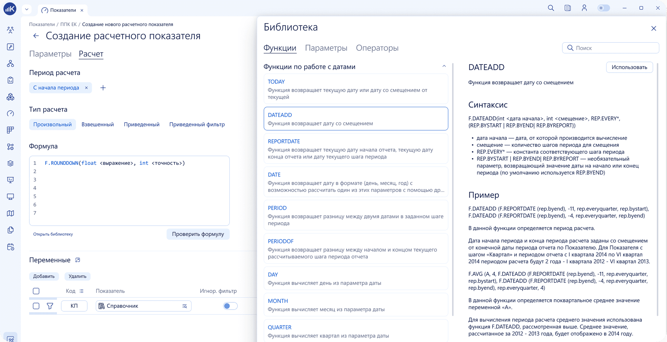
System object configuration
- Adding users to the system
- Linking users to specific Positions in the Organizational Structure
- Ability to restrict data access (access schemes)
- Creating data marts - base indicators with the capability to load data on a planner's schedule
- Calculating values using formulas with data marts
- Calculating achievement of target indicator values
- Combining Target indicators into KPI maps
- Ability to transform obtained target indicator values and KPI map results via a Transformation Matrix
- Creating tabular reports
- Creating monitor panels
- Adding users to the system
- Linking users to specific Positions in the Organizational Structure
- Ability to restrict data access (access schemes)
- Creating data marts - base indicators with the capability to load data on a planner's schedule
- Calculating values using formulas with data marts
- Calculating achievement of target indicator values
- Combining Target indicators into KPI maps
- Ability to transform obtained target indicator values and KPI map results via a Transformation Matrix
- Creating tabular reports
- Creating monitor panels
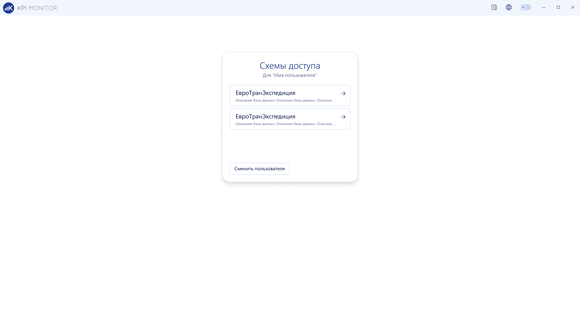
Database administration
- Internal server settings
- Creation/deletion of Information databases
- User monitoring
- License management (including configuration of personal ones)
- Viewing Change history
- Viewing events
- Monitoring calculation activity
- Internal server settings
- Creation/deletion of Information databases
- User monitoring
- License management (including configuration of personal ones)
- Viewing Change history
- Viewing events
- Monitoring calculation activity
System object configuration
- Adding users to the system
- Linking users to specific Positions in the Organizational Structure
- Ability to restrict data access (access schemes)
- Creating data marts - base indicators with the capability to load data on a planner's schedule
- Calculating values using formulas with data marts
- Calculating achievement of target indicator values
- Combining Target indicators into KPI maps
- Ability to transform obtained target indicator values and KPI map results via a Transformation Matrix
- Creating tabular reports
- Creating monitor panels
- Adding users to the system
- Linking users to specific Positions in the Organizational Structure
- Ability to restrict data access (access schemes)
- Creating data marts - base indicators with the capability to load data on a planner's schedule
- Calculating values using formulas with data marts
- Calculating achievement of target indicator values
- Combining Target indicators into KPI maps
- Ability to transform obtained target indicator values and KPI map results via a Transformation Matrix
- Creating tabular reports
- Creating monitor panels
Database administration
- Internal server settings
- Creation/deletion of Information databases
- User monitoring
- License management (including configuration of personal ones)
- Viewing Change history
- Viewing events
- Monitoring calculation activity
- Internal server settings
- Creation/deletion of Information databases
- User monitoring
- License management (including configuration of personal ones)
- Viewing Change history
- Viewing events
- Monitoring calculation activity